Well, it's SHOWTIME again and that means ART so let's get to it.
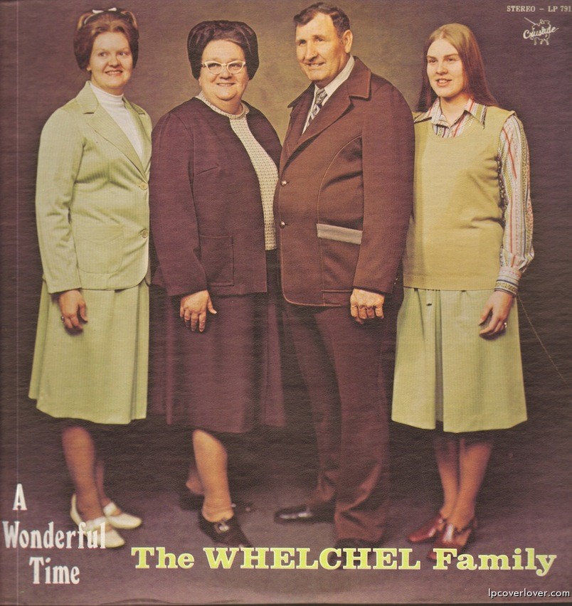
This show is kinda special, seeing as how we get to play with Human Ottoman, a band that I love, so I had to really make it a good one and that led to hesitation and procrastination as I pretended to mull it all over and not just dread getting started. I had the idea for creating a human ottoman pretty well set in mind even down to the source material for legs:
Perfect, four of them, arranged leg-like, though being cut off in places I had to make it work, add an arm, etc. I'm really happy with how I managed to clean up the second from left while making her look like a somewhat sloppy dresser:
So I was happy and fully set for the ottoman but then what? How to bring Wups in and make it work instead of being a bunch of different stuff just slopped on there? I dropped in the logo and added something that I'd had in mind, a little Little Janice:
Psychedelic tweaking, some trails, and there was something, but still no cohesion. A random background is generated and then I took my first break.
An ottoman needs a room and that led me to dig up a couple pics of my own surreal fireplace:
Add a stock image of a checkered floor and all was looking nice and snazzy and another idea I'd had for a while was tossed in for good measure:
And so the first draft was created:
I tried in vain and for no reason to resist the inevitable, aligning Vickie's eyes with the alight eyeballs...
I then walked away again and only at work the next day did it come to me that the tie to the whole had become Vickie, permeating the work, creeping you out, and so poor little Janice lost her self, but only at the clear extreme and finality of that trippy flight, where again Vickie takes over, laughing pixie-like in the fevered face of the viewer.
All tied together now it was down to the text and that's the part I dislike the most. With so many font options and none of them looking right I now randomly choose somewhat worthy contenders, warp them and play until I feel that I can't win. But I kept at the hidden possibilities of the various tools and found a way around what I thought were unimprovable and yet unworthy color choices. Messing with fill levels and stroke luminosity I finally cut the gutwrenching and made myself happy.
And weep not for Janice. I did feel the guilt of losing her cool visage and so I left her in her full glory on the impending sticker.